
Our new logo represents Wesley’s many options and services encircled by the warmth of community, lovingly fashioned to work together like pieces of stained glass. We’re excited to introduce you to the new style and spirit of Wesley.
With new communities, services and programs, we wanted a way to better reflect who we are today and our growing organization. Working with JayRay in Tacoma, we formed the Wesley Brand Team — a group made up of residents, staff, board members and a business partner — to help ascertain Wesley’s key characteristics. Identifying the personality, promise and position of Wesley would help the team decide on the new messaging and graphic representation.
“Friendly and warm rose to the top of the list,” beamed Naniofa Poulivaati-Mounga, Life Enrichment Director at Wesley Des Moines. “I love that about us. We are one big family.” Genuine, values-driven and engaged were other personality characteristics included in the new brand.
When compared to other providers, Wesley offers more choice in housing types, amenities and delivery of care. “Having our own in-home care agency allows us to provide more care options for the residents on our campuses and people off campus throughout King and Pierce Counties,” said Kevin Anderson, President and CEO.
Choice was the clear differentiator of our position in the marketplace. This led to the creation of our new tagline:
Community – Choice – Continuing Care
What will always be true becomes Wesley’s promise. “We put people over profits,” said Kevin. “For us, it isn’t about building wealth for investors. We make decisions based on what is the right thing to do for the people we serve: residents, employees, home health clients and their families.”
With these attributes chosen, it was time to choose a logo. JayRay presented the Brand Team with five options, each a very different font and style. The team members divided into groups to present a case for the logo they liked. After much debate, the logo was chosen.
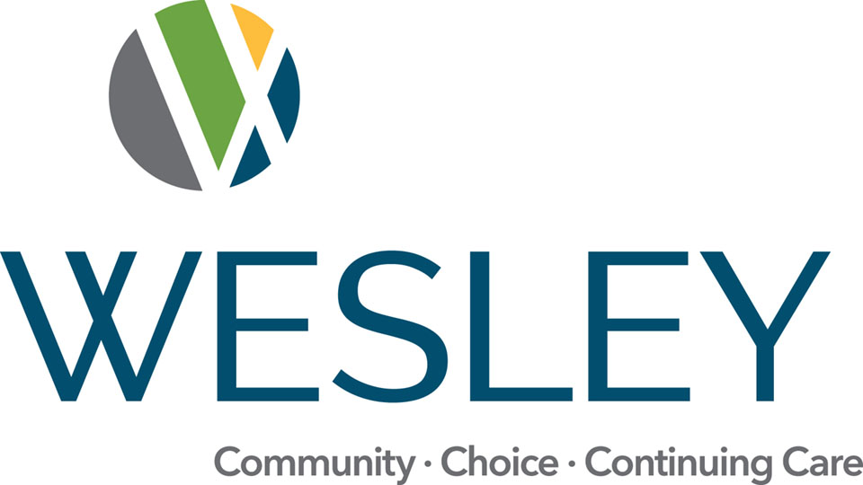
Our new logo represents Wesley’s many options and services encircled by the warmth of community, lovingly fashioned to work together like pieces of stained glass. “Wesley has a strong tie to the United Methodist Church,” said Christine Tremain, VP of Marketing and Development. “To me, the stained glass visual represents that connection and the spiritual component that Wesley offers. I was won over when I realized that.”
Traditionally, stained glass artisans used color to convey meaning.
- The blue of the sky symbolizes heaven, hope, sincerity and piety.
- Green, the color of grass, represents growth and rebirth.
- Yellow, seen in the haloes of saints, evokes divinity, power and glory.
Wesley’s new brand is more than just a logo. It is a visual representation of the Wesley community: the people who live and work at our campuses, the caregivers who provide in-home services in the greater community and the visionaries who created the solution for older adults by starting Wesley.
Christine added, “With our new brand, we celebrate our history and prepare for an exciting future.”